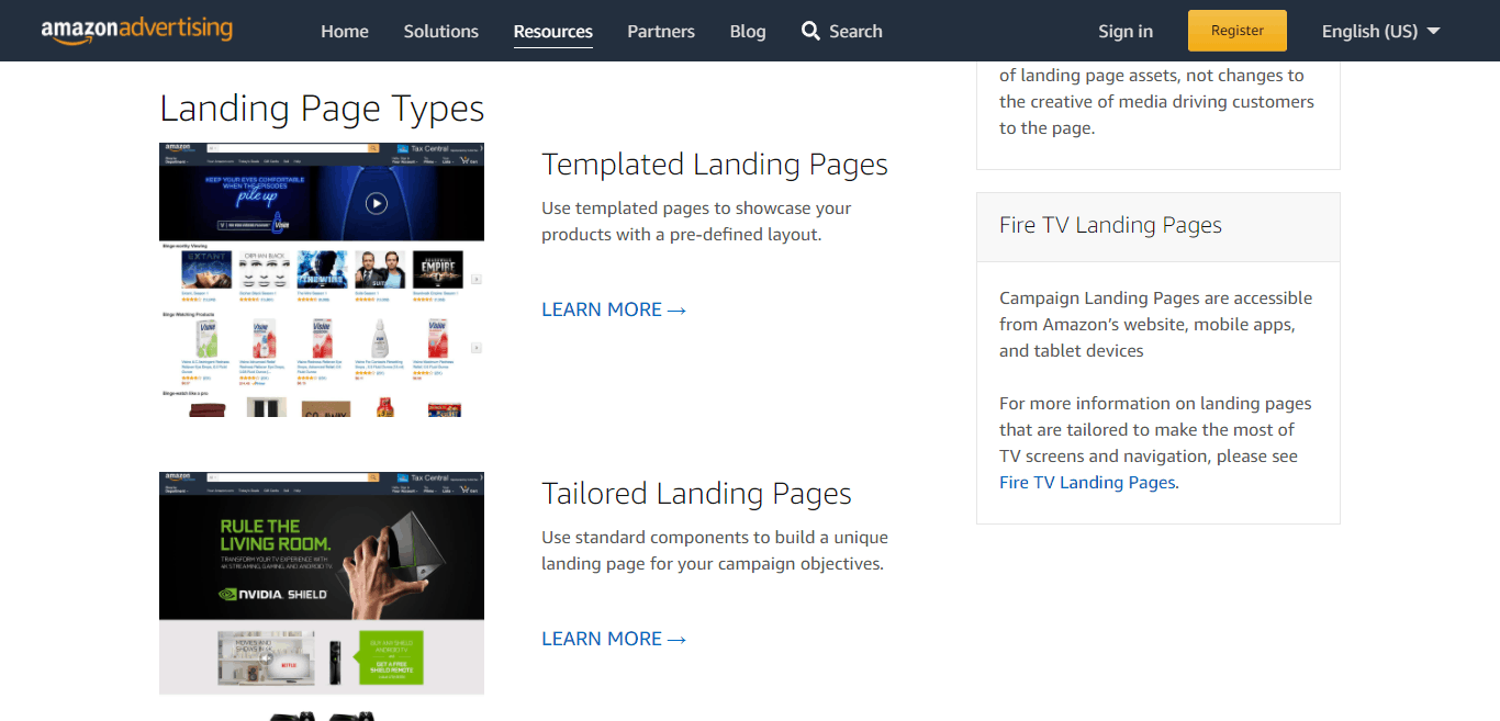
Amazon has some laid down guidelines for the Campaign Landing Page that every advertiser must adhere to. These guidelines are laid down to ensure that the high standard for the content is not compromised.
Let’s take a look at some of these guidelines.
Amazon Campaign Landing Page Creative Guidelines
The creative guideline covers aspects of the campaign like the resolution of images, Amazon navigation, multi-platform support, etc.
1. High Resolution
All images used on the Campaign landing page must be high-resolution images. They must be at least 2X quality images on tablet devices and desktops and 3X quality images on phones.
The major aim of this requirement is to ensure that the images used by advertisers to market their product match the same level of quality of the graphics on the Amazon home page.
If the quality of the image used by advertisers is below standard or doesn’t match the Amazon homepage it rubs off in a bad way on Amazon.
2. Amazon Navigation
Amazon has a global navigation menu displayed on all Campaign Landing Pages. Advertisers are not allowed to alter or remove this navigation menu.
This is because the Amazon app views the navigation menu as native content and it gives the shopper easy access to frequently used features like cart and search. The navigation menu also preserves the logged-in status of the shopper.
3. Multi- Platform Support
Every Campaign Landing Page must be accessible to shoppers no matter where they encountered the ad. To make this possible, Campaign Landing Pages have built-in support for web browsers on tablets, phones, and desktops. Campaign Landing Pages are also accessible to shoppers using the Amazon shopping app on Android, Fire OS, and iOS.
3. Customer Value
Amazon expects every product-focused campaign to contain information about the benefit of the product to the customer. Alternatively, the campaign can also serve an educational purpose aside from the information existing on the product’s detail page.
This is important because Amazon considers the product detail pages to be a trusted source of information for shoppers.
Campaign Landing Page Components Guidelines
Amazon also has some laid-down guidelines for the components of the Campaign Landing Page.
Hero Image
A major component that every Campaign Landing Page must have is a hero image. A hero image is an oversized banner image at the top of the webpage which gives the shopper a glimpse of the product. Due to the accessibility of Amazon through multiple platforms, three versions of each hero image are required. The images for the various platforms have different safe zones based on the minimum width of the Amazon navigation for each platform.
Hero Image Guidelines
Every hero image must have valid alt text that can be used by screen readers.
As already stated, Amazon requires three versions of each hero image to support multiple platforms. Below are the guidelines for the hero image for each platform.
Specification for Desktop Image
- All images for desktop platforms must be designed at 2X resolution and be 3000px wide.
- Only JPG and PNG formats are allowed.
- All important content and text must be contained in the center 1800px.
- The maximum file size for desktop images is 500kb.
Specifications for Phone Images
- Only JPG and PNG image formats are accepted. The image must be designed at 3X resolution and be 1242px wide.
- Just like desktop images, all text and important content must be contained in the center but at 960px. Depending on the width of the device, the edges will be cropped off.
- The maximum file size is 500kb
Specifications for Tablet Images
- Tablet images must be in JPG and PNG format. They must be designed at 2X resolution and 2560px wide. The maximum file-size for tablet images is 500 kb.
Animated Hero Guidelines
Animated hero components are not supported on tablets or phones, they are only compatible with desktop browsers. Static hero images are used for tablets and phones, but a hero component on a desktop can use a video file to create an animated effect.
The recommended dimension for the video is 1500x300px. Mp4, .avi, .mpeg, .dv, .m4v, and .mov are the acceptable video formats. The file size of the video must not exceed 500mb. Animated videos cannot include sound. They are muted. They can also be set to play just once when the page first loads. They can also be set to loop.
The video can be set to match the full width of the browser window or you can use an optional background property to create “sleeves” behind the video to support the widescreen.
Aside from the background image, a hero image component can also contain linked images, video players, and buy boxes.
Hero Contents
1. Buy Box
A hero image must contain a buy box. The buy box is a box on the right side of the product detail page where customers can add items to their cart without clicking through the product’s detail page. The buy box displays live product information such as the price, title, product’s photo, prime eligibility, and star rating.
The height of the buy box is often dependent on the selected product.
On mobile phones, the buy boxes are attached below the parent hero image and are not included in the height of the hero image. The background color of the hero image is reflected on the buy box. Amazon allows only one Buy Box per hero image. This notwithstanding, Buy Boxes can use a dropdown menu to feature up to five product variations (size, color, media, etc). The product information displayed will be dependent on the variation selected.
Buy Boxes can hide the product’s star rating, add to cart button or product photo. But the price of the product and the product’s title cannot be hidden.
The advertiser can also show vendor-powered coupon offers and subscribe and save offers on eligible products through the Buy Box.
2. Lightbox
A hero image can contain smaller links that open a lightbox experience that supports images, video, and Buy Boxes.
A lightbox popup is a window overlay that appears at the top of a webpage. When the lightbox appears the background is disabled and dimmed, this makes it impossible for the shopper to interact with other content on the page. In most cases, the lightbox can block some of the content on the page.
Only five lightboxes are permitted for each hero image. Each lightbox can contain one video, image, or product ASIN. lightboxes that feature an image can have an optional caption of up to three hundred characters. The acceptable image format for the button image for each lightbox is PNG and JPG. The image must be designed at 2X resolution and must be at least 132px in height. The maximum file size is 50kb.
If a lightbox contains a Buy Box, the Buy Box can only contain one product ASIN. If a tablet or phone is in landscape mode, the lightbox pagination dot may overlap the bottom of the videos and images. It is therefore important that relevant constants and text be kept away from the bottom. Alternatively, you can use text captions.
Customers can navigate through hero images with multiple lightboxes by swiping horizontally on phones or clicking the arrow on desktop screens. This will enable the shopper to see the contents of all the lightboxes.
3. Linked Image
Hero images on the Campaign Landing Page can contain other images that are linked to other pages. These pages can be off or on the Amazon website. The resolution of the linked image must match the resolution of the parent image. Aside from this, there are no other size restrictions on the linked image.
If a linked image is not linked to an Amazon page, it must be linked to an HTTPS-enabled website that works on tablet, mobile, and desktop browsers. Each platform’s hero image must have a separate linked image asset.
4. Video
Videos displayed inside the hero images must be located within the center safe zone of the image. Unlike images, the same thumbnail assets and video are used across all three platforms.
Guidelines for Product List / Carousel
Groups of products from the same advertiser can be displayed on Amazon Campaign Landing pages. The product lists displayed on the landing pages are formatted as horizontal lists. This list can be navigated by the left and right arrows on desktop browsers. On tablet and phone devices, the list is touch-enabled.
Product lists on landing pages must contain a minimum of 3 individual products sold on Amazon and a maximum of 20 products. Important information about the product such as the star rating, the product image, prime eligibility, and the price of the product is displayed on the product listing. The information cannot be edited and it must match the information on the product’s detail page.
Adding a title to the products listed in the product list is optional as well as including the “add to cart” button. If the “add to cart” button is enabled, it will only be displayed for products that do not violate Amazon’s Minimum Advertised Price Policy and products that are in stock.
Product lists automatically show vendor-powered coupon offers under eligible products. And will only display the prices of items that are available or in stock.
Video Guidelines
Amazon Campaign Landing Pages can contain video players. These video players are centered on the page as distinct elements or embedded in header images. The acceptable video format for Campaign Landing Pages are: .mp4, .avi, .mpeg, .dv, .mov and .m4v.
A 1280x720px image is required to serve as the video’s thumbnail for the video player. The video must have audio. The video should not be longer than 3 minutes, must be at least 1280x720px, and must not be more than 500MB in size.
The videos on Landing Pages can be set to auto-play inline when the page is opened on desktop browsers, this is however without audio. And they can also be opened in a large modal window in the desktop view when the shopper clicks on the video’s thumbnail.
Campaign Landing Page videos cannot be set to modal playback and auto-play on mobile apps and browsers. Amazon video player is incompatible with the following tablet and mobile devices:
- iOS devices older than 7.0
- Amazon Shopping App on Fire Tablet devices older than Gen 8
- Android devices older than Android version 4.3
- Silk Browser on Fire Tablet devices older than Gen 7.
Guidelines For Tabs
Amazon Campaign Landing Pages have tabs that make switching between products easy for the customer. A tab is a navigation tool that enables the customer to view other products and content without exiting the page. A Landing Page can have one set of tabs. This is about five tabs per page. Depending on the preference of the advertiser, the landing page can use custom branded tabs or the standard Amazon UI pattern for tabs.
If the tab has a custom image, the image assets must fit inside the tab content. In most cases, the hero image is resized to fit the screen width of smaller devices. If you are using custom tabs, the image asset must be at least 132px tall for phones and be designed at 3X resolution.
For desktop and tablet platforms, the image assets must be designed at 2X resolution and 88px tall. No matter the type of tab being used, the tab must have a vertical position on the page. Tabs on landing pages can contain content below and above them.
Text Block Guidelines
The text block is a vital component of the Campaign Landing Page. It contains links, headers, special characters, and bold and italic text. The text block displays HTML text on Campaign Pages. It can be aligned to the center of the page or the right or left.
A text block displays the same text content across all three platforms ( desktop, phones, and tablet). The components of the text block are designed to automatically match the style of other Amazon UI text on the Landing Page.
The text block can be added as a child component of the gallery panel or a hero image. In tablet and desktop, the text block must match the width of the hero image’s safe zone. On phones, the text block should be stretched to fit the screen’s width.
Image Gallery Guidelines
Image galleries can be used to feature up to five images in the same area on the Amazon Campaign Landing page. Even though different images are featured, all the images must be the same size. The maximum file size for the images is 500kb.
The ideal size for gallery images is a width of at least 1800px, and a height of about 300px. For tablet and desktop platforms, gallery thumbnails are generated automatically. These thumbnails can be positioned in different areas of the gallery. They can be positioned on the top, at the bottom, on the right, or left of the gallery.
These thumbnails are hidden on phones. The customer will however be able to swipe right or left through the gallery panel. Gallery panels can include other components like lightboxes, buy boxes, and linked images. For tablet and desktop platforms, the components of the panel (lightbox, buy box, linked images) can be set up as a sub-component of the entire gallery. This means that the panel will not be dependent on a selected panel.
It is mandatory for all gallery panels on the Amazon Landing Page to have valid alt text that can be used by screen readers.
Spacer
A spacer adds vertical space to the Campaign Landing Page. It cannot contain child components. The height of spacers varies based on the platform being used. The background can be a solid color or linear gradient.


